Apple’s iPhone 14 Pro Makes Ditching Android More Tempting Than Ever
Before we get into this, you should know that this is my first time reviewing an iPhone. I’ve long established myself as “the Android girl,” because I started my smartphone journey with that mobile platform and eventually grew to prefer it over my initial experience with the iPhone. The last time I wielded one of Apple’s phones as my daily driver was the iPhone 4S. It’s been a while.
You can imagine my conflicting emotions enjoying my experience with Apple’s iPhone 14 Pro. I’ll get into details later, but what struck me almost immediately about this phone is how much easier it is now to go back and forth between iOS and Android without missing much. And while there are some differences in usage between the two operating systems, like how you swipe around the interface or go back a page within an app, the feature parity feels almost one-to-one now.
Android may have all the bragging rights regarding Google integration and folding smartphones, but Apple keeps it simple by sticking to its tried-and-true formula and improving upon it with every iteration. The iPhone 14 Pro isn’t an immediate upgrade for those with last year’s iPhone 13. But its nighttime photo shooting capabilities, one of the features that make Google’s Pixel smartphones most compelling, might be something you finally give up Android to try.
Note that this review does not cover the concurrently released iPhone 14, which starts at $799 for the 6.1-inch iPhone 14 and $899 for the iPhone 14 Plus. That model features last year’s A15 Bionic chip, slightly tweaked, along with the 14 Pro’s crash detection and Emergency SOS capabilities. Apple also promises better battery life on its more affordable model. We’ll have a full assessment of that lineup coming soon.
Apple iPhone 14 Pro Specs & Features
I’ve fallen deeply in love with the new purple.
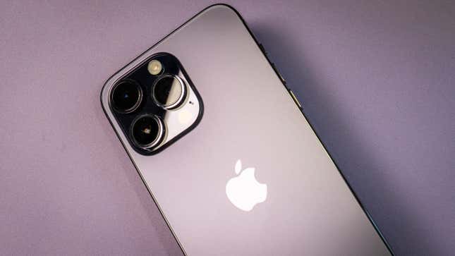
The iPhone 14 Pro comes in two variations: Pro and Pro Max. The Pro version has a 6.1-inch Super Retina XDR display made with OLED technology, while the Pro Max has a 6.7-inch screen with a slightly larger resolution. Both Pro models have the Dynamic Island in place of a lifeless notch, and both feature Apple’s ProMotion technology, which enables the adaptive refresh rate to skate between 1 Hz and 120 Hz (for battery life). I’ll get into how that works in the next section. For continuity’s sake, I should note that I wrote this review primarily based on my experience with the iPhone 14 Pro Max.
Apple does advertise a maximum brightness of 2000 nits outdoors. But like the Android phones that do the same thing, it only goes that high if you’re outside on a sunny day and turn on adaptive brightness mode. The iPhone 14 Pro and Pro Max usually top out at around 530 nits if you manually increase the brightness.
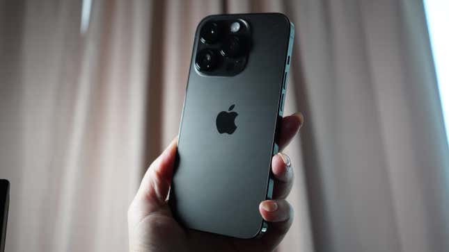
If choosing between the Pro and Pro Max, consider whether your lifestyle calls for the bigger screen. The Pro Max is better for reading everything from Reddit to digital papers, but it’s less wieldable one-handed for those with smaller fingers. I found thumb-typing difficult without cradling both sides of the device, and it was hard for my dominant right hand to reach the left-placed back button on some apps. If you constantly rely on that one-handed use case, consider the smaller iPhone 14 Pro.
Apple sent me the Pro Max in Deep Purple, and I am in love. Several times, I’ve commented that this is the smartphone color for goth girls worldwide. It’s not as purple as the photos I’ve included here depict it being. It’s more of a subdued violet compared to, for example, the lavender-purple casing on the Samsung Galaxy Z Flip 4. The other available colors are Gold, Silver, and Space Black. Apple sent over the smaller iPhone 14 Pro in that latter color, which appears remarkably noir in person—even the aluminum edges are black. Apple also bundled in a MagSafe Leather Case in Ink that matches the exterior chassis quite nicely on the Pro Max, but I think you can achieve a cooler effect with something see-through.
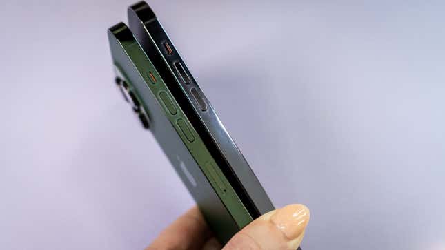
You’d be right in thinking that the iPhone 14 Pro isn’t much of an update compared to its predecessor, the iPhone 13 Pro, when it comes to design. The backside still shows a triple-camera array, with the LED flash right above the third camera lens on the right—though the flash module has been improved with nine new LEDs—plus all the requisite side buttons. The only glaring difference is that there’s no SIM slot on the iPhone 14 Pro, as Apple has opted entirely for the new eSIM standard, which promises to be seamless and more secure than physical SIM cards. Unfortunately, I did not have the opportunity to port over a number and try the process, but onboarding with the network access Apple provided was turnkey. Here’s to hoping everyone else has the same experience (and if not, please email me to let me know).
Apple iPhone 14 Pro Screen
Take a vacation to a Dynamic Island.
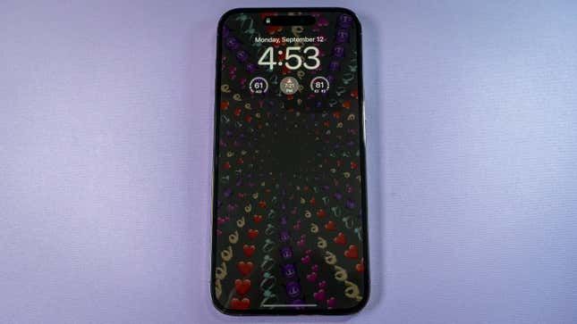
I scoffed a bit when I heard Apple added an always-on display to the iPhone. I said, “Ha! That’s something Android’s had for a while.” While it’s true that I first fell for the idea of the AOD, as it’s abbreviated, on Motorola’s 2013 release, the Moto X, the iPhone 14 Pro, and its customizable Lock Screen make me wish Samsung and Google were doing a little more with their respective versions of the tech.
Apple’s always-on display is much more subtle than what you’d get with the Galaxy Z Fold 4, which I’ll use as an example since it’s the Android phone I’m carrying around these days. Whereas Samsung lets you choose between different clock faces and graphics to match the rest of your interface, Apple dims the Lock screen wallpaper you have in effect. Your personalization comes through rather than having to choose something specific to display. Slightly more color peers through the 1 Hz refresh rate on the Lock Screen, too, which resulted in instances where I didn’t even realize that the always-on display was on.
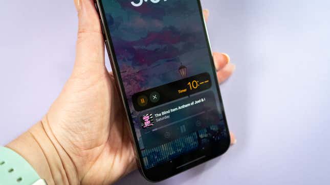
You will need iOS 16 to get access to that Lock Screen coolness. Any widgets you place on the Lock Screen will also come through in the AOD, as well as notifications and media playback controls. And if you have an active app in the background, like a timer, you’ll see that on the Lock Screen as the iPhone 14 Pro dips in and out of its always-on display mode.
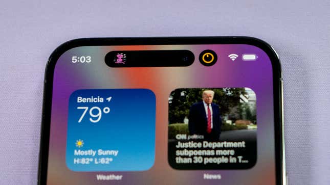
I have to hand it to Apple to figure out how to turn the notch into something useful. The Dynamic Island elicited a few chuckles when announced at Apple’s Far Out keynote. But I would rather have the notch do something if it’s going to take up space from the screen.
Dynamic Island is essentially a software solution for getting some utility out of the part of the iPhone 14 Pro housing the front-facing camera and Face ID sensor. It uses the Now Playing and CallKit APIs already utilized by iOS developers to minimize certain apps to that part of the screen. This means devs aren’t immediately scrambling to make their apps work with this iPhone 14 Pro-only capability. So far, the apps that can use the Dynamic Island are media playback apps like Spotify, Pocket Casts, and Apple Music, plus utility apps like the phone and timer. Later this year, Apple says you’ll be able to use ride-sharing apps or peep sports scores in the Dynamic Island.
You can concurrently access two apps at a time from the Dynamic Island. Simply tap to expand it. The process is quite fluid, and it’s nice not to worry about swiping down when trying to access something, as I would on an Android device with its notification shade. You can also use it to determine if something is playing in the background or through your headphones.
Would I like Apple to figure out how to shrink that part of the screen so there’s nothing there? Absolutely. Remember, I come from the land of hole-punch cameras, so I’m used to seeing most of the screen when I’m scrolling vertically. When used in landscape mode, apps like YouTube will letterbox the video so that the Dynamic Island doesn’t block out part of the view. But in portrait mode, the pill-shaped island is extremely obvious. If this is something that perpetually bothers you, remember that what you get in exchange is FaceID, which works nearly flawlessly compared to my experiences with competing Android devices.
Apple iPhone 14 Pro Camera
Nighttime photos have improved.
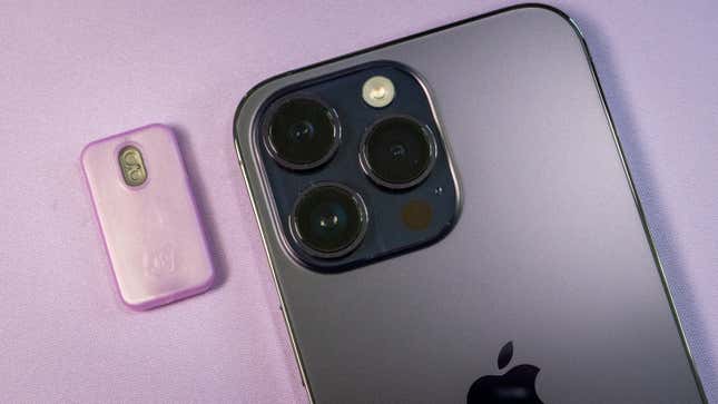
As with every new model of the iPhone, Apple has improved the primary camera capabilities of its Pro-level flagship device. Whereas last year’s iPhone 13 Pro was equipped with a 12-MP triple-camera system, this year’s expands on that by adopting a quad-pixel sensor. This works similarly to the nona- and tetra-binning technology in Samsung’s respective devices and Google’s Pixel sensor. In Apple’s case, the technology tries to optimize light capture by grouping four pixels into a quad-pixel sensor to bring in more light and detail. This sort of technology has become the status quo for smartphone cameras currently on the market, and you’ll find it used in most flagship and pro-level devices.

The primary camera on the iPhone 14 Pro is a 48-MP shooter. But as I mentioned, it typically shoots at 12-MP with that quad-pixel technology enabled. If you want all megapixels engaged, you can switch to Apple’s ProRAW mode from the settings panel and shoot photos at the full 48-MP resolution for tinkering later in a professional photo editing suite. Apple says the camera sensor on the iPhone 14 Pro is 65% larger than its predecessor and uses a second-generation sensor-shift OIS to help aid in clearer shots when your subject is in motion. That larger sensor also brings in more light, which is how the iPhone 14 Pro boasts its f/1.78 aperture.
The second camera on the iPhone 14 Pro is a 12-MP Ultra Wide sensor with an f/2.2 aperture and 120-degree field of view, which can be aggressive with some of your photo subjects if you don’t properly frame the shot. You can see an example of it in the embedded camera samples.
The third camera is a 12-MP Telephoto lens with a similar aperture as the primary camera. The telephoto can zoom in up to 6x optically and up to 15x digitally. I didn’t get a chance to compare the iPhone 14 Pro Max’s zoom capabilities to those of the Galaxy S22 Ultra, which boasts so-called “Space Zoom.” However, I was able to compare it to the Pixel 6 Pro’s built-in 20x digital zoom and was impressed at the 14 Pro Max’s ability to sharpen subjects from far away. I took two 15x shots of windmills from miles away with the 14 Pro Max and the Pixel 6 Pro. Both photos came out fairly sharp, enough that I could tell what the structures were in the distance. The only glaring difference between the two photos was the color tuning. It’s interesting to see how Apple tones its photos compared to Google.

Daytime photography on the iPhone 14 Pro isn’t drastically different from that on the iPhone 13 Pro. Images are clear, while Portrait mode continues to impress. I also like that the iPhone 14 Pro can capture still images from a moving subject, which was especially helpful when snapping photos of my kid on a swing set. The other thing I liked is that, even in landscape images, there was balanced detail and sharpness throughout the 14 Pro’s photos, even if something appears muddled up close.

I’ve been tuned to Google’s Pixel algorithms all this time, so it’s nice to see Apple’s top-tier iPhone line up to par with the Pixel’s Night Sight capabilities. Indeed, while I was shooting landscape photos at night, I preferred the iPhone 14 Pro Max’s result because it was less intense than the Pixel 6 Pro’s. Google’s camera algorithm is aggressive in comparison to Apple’s. It would often light up parts I didn’t necessarily want in the photo. For instance, in the initial night shot below, the Pixel 6 Pro lit up the roof’s awning on the right side of the photo, generally bringing up the detail in other parts where light is present. The iPhone 14 Pro Max’s result is more tuned to sharpening rather than increasing the exposure, so there’s more focus on the moonlit sky than everything else included in the scene.

But the next night, I preferred Google’s result. I shot from a different angle and wanted to have some distinction in the trees and shrubbery in the photo’s foreground. The area around the moonlight is more detailed in the Pixel 6 Pro’s result than the iPhone 14 Pro Max’s, which opted for more of a silhouette effect. In both instances, I set the moon hidden in the clouds as the focus point.

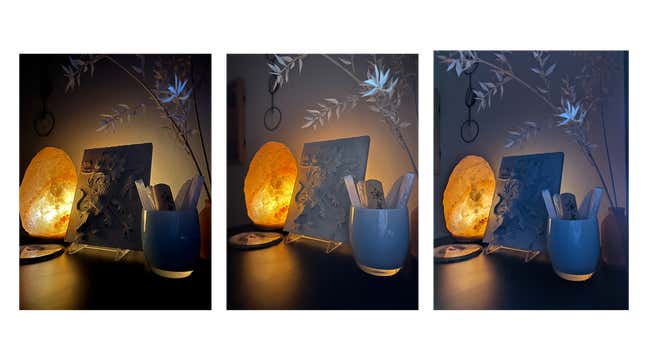
At the very least, seeing the Google Pixel 6 Pro and iPhone 14 Pro on the same spectrum regarding nighttime photography is nice. The 14 Pro is likewise capable of indoor night shots, especially compared to the iPhone 13 Pro. Images are not only a tad brighter, but they’re a little less yellow-tinged.
The iPhone 14 Pro’s video recording capabilities have also improved. The phone can record 4K and 1080p video at up to 60 frames-per-second (fps) and 720p video at up to 30 fps. Like the Samsung Galaxy Z Fold 4 I reviewed, I used the iPhone 14 Pro to follow around my kid and liked how seamless it was to switch between zooms with ease. I also tried on the Pro’s new Action Mode, which effectively acts like a gimble when you’re filming, and things are bumpy. I am still dealing with some post-COVID symptoms, so there was no action from me. But I could see the subtle softening of my walking with the camera with Action Mode toggled on compared to when it’s off. It’s especially effective at leveling the scene as you turn with the camera.
I did not get enough time to test the full abilities of the front-facing TrueDepth camera on the iPhone 14 Pro Max. It’s a 12-MP sensor with an f/1.9 aperture and built-in autofocus. It can take portrait shots with bokeh in the background and different portrait lighting effects. It also has night mode built in. Physically, I haven’t been feeling great, so the self-love photoshoots have been nill. However, I did record a few TikTok confessionals with the front-facing camera, and I appreciate its sharpness. And during FaceTime, my caller on the other line said the video looked crisp and clear.
Apple iPhone 14 Pro Battery
Performance has also improved somewhat.
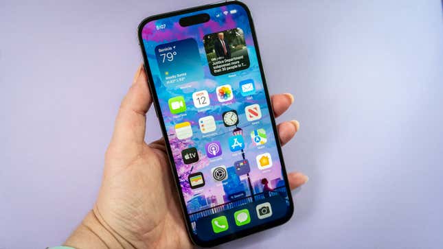
The iPhone 14 Pro and Pro Max are equipped with Apple’s new A16 Bionic chip. This processor is a 6-core CPU coupled with a 5-core GPU built on Apple’s first 4nm process. That means it’s very smol. The A16 Bionic chip is what enables abilities like Dynamic Island, high brightness, and the always-on display. It’s also the brains behind the capabilities of the 48-MP primary camera.
As a side note: The regular iPhone 14 has a reconfigured A15 Bionic chip, akin to the one that was in the iPhone 13 Pro. I’ll talk more about the experience with that one when I get to the review.
Apple’s homemade processors continue to dominate our internal benchmark charts. On Geekbench 5, which we use to assess a chip’s relative capabilities, the A16 Bionic tested 36% higher than the Z Fold 4’s Qualcomm Snapdragon 8+ Gen 1 and the Pixel 6’s Tensor CPU. It’s about 12% higher than last year’s iPhone 13 Pro, which ranks alongside Apple’s promise of being 10% faster than its predecessor. I’m waiting to revisit these numbers when the Google Pixel 7 and 7 Pro launch next month. But if you’re shopping between the regular iPhone 14 and the Pro model, choose the latter if things like high-graphics mobile gaming and live streaming from your phone is something you participate in.
You should know: the second-generation Razer Kishi recently came out for iPhones, and it fits both the iPhone 14 Pro and Pro Max just fine. My only bummer is that my copy of Elder Scrolls Online exists solely through Google’s Stadia service, so there was no way for me to try to play it with the new iPhones.
Battery life has also improved with the iPhone 14 Pro and Pro Max. Apple doesn’t typically disclose the mAh size of its batteries publicly. But its documentation promises all-day battery life: up to 20 hours of streamed video playback on the 14 Pro and 25 hours on the 14 Pro Max.
The battery rundown test is typically the last thing I test for each review, so I’ll have to follow up with the iPhone 14 Pro and 14 Pro Max’s final numbers in our video playback test. For now, I can say the iPhone 14 Pro Max has been streaming a 24-hour YouTube video at 200 nits for nearly 16 hours. It’s still chugging along at 29%.
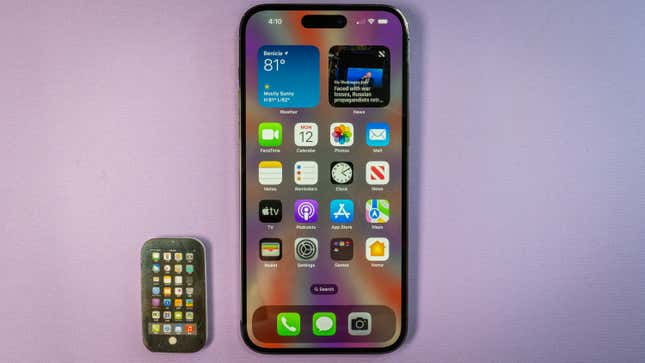
If you want access to the cool-looking lock screen with the always-on display, you’ll need iOS 16. It comes pre-bundled on both the iPhone 14 Pro and Pro Max. You can use the always-on lock screen with focus mode, don’t worry. iOS 16 also brings with it editable and retractable messages, and the iCloud Shared Photo Library. I previewed some of these new features when iOS 16 was still in beta.
I’m primarily an Android user, so whenever I switch back to iOS, I trip up a little bit. I tend to panic once you remove my back and home buttons, and I had to relearn some of my most-used cross-platform apps. But overall, I found the experience less harrowing than I initially assumed it would be (after all, the last time I used iOS daily, it still employed skeuomorphism).
What helps is the existence of almost every single Google app in the Apple App Store, which means I don’t have to hop ecosystems to live with the iPhone. I receive WhatsApp chats and Android Messages through their respective web links in the Chrome mobile browser and upload all my images to Google Photos. I even switch between Gboard and the default iOS keyboard. The only app I missed was Animal Crossing: Pocket Camp, a game I’ve invested years of playtime in since it launched. It does not work cross-platform, and I wasn’t about to start over with an entirely new game on iOS.
I particularly appreciate how often iOS asks me if it’s okay to do something. For instance, I installed Reddit from the App Store because Sister Wives is back on, and it’s when I’m most active on the app. But I forgot how often the Reddit app pings you with nonsense, and so I was relieved when iOS 16 asked me if I wanted to revoke notification access. I believe this sort of use case contributes to why folks find iOS more palatable than Android, even as Google has added new abilities to make its mobile OS more mainstream and transparent. However, it still depends on the user having a bit of expertise in navigating the software, whereas iOS is more helpful in terms of feature discovery. It’s much easier to have the system remind you to take care of your privacy than to dig through the settings panel for the option.
If you watched the Far Out Apple event, you know the company made a massive deal of its new emergency features. The iPhone 14 Pro and Pro Max have crash detection capabilities made possible by their new high-dynamic range gyroscope, which is unique to this lineup of iPhones. It works like Google’s car crash detection feature on its Pixel devices: If you crash, the iPhone 14 Pro will light up and ask if you’re okay. If you don’t respond, it will then call out to emergency services using a voice loop of your location.
The Emergency SOS feature is a little more sophisticated in terms of the help it gets you. Beginning in November, the iPhone 14 Pro will use its custom antennas to connect directly to a satellite high up in space, ensuring you can access live people regardless of cellular service. Once a connection is established, Apple will route you to one of its aids via an OnStar-like call center.
At launch, iPhone 14 owners will get two free years to start with the Emergency SOS service via satellite. It’ll be limited to U.S. and Canada at launch, and we’re still waiting for details on how much the service will cost when it goes live. It’ll be interesting to see how this service is received when it goes live and if Google has any plans to counter with its own offerings.
iPhone 14 Pro Price & Availability
Definitely worth the upgrade.
The iPhone 14 Pro is the best iPhone you can get if you want to get one—and if you can afford the $1000 starting price for the Pro or $1099 for the Pro Max. If you’re on the iPhone 11 or 12, it might be time to upgrade devices, mainly to get access to better internal hardware and camera capabilities.
But if you’re on the iPhone 13 Pro or Pro Max, there is no reason to jump ship to this particular model (I mean, you can justify it to yourself if you like— I won’t stop you.) While you get the benefits of a new processor and slightly better camera sensors, the increase in performance is minimal between last-gen and current-gen. And while the Emergency SOS and built-in safety features are crucial if you’re the type to venture out of the network or into the backwoods, the car crash and emergency detection features are both coming to the Apple Watch Series 8, second-gen Apple Watch SE, and Apple Watch Ultra, so you won’t need a new smartphone to access them.
I can’t tell you yet if the iPhone 14 Pro and Pro Max are worth switching to from an Android device—maybe you’re one of the many disgruntled Pixel 6 users out there and are tired of the Google track. Unfortunately, we’re waiting for the Google Pixel 7 and 7 Pro to launch, so it remains undetermined. However, I do plan to make a side-by-side comparison of the year’s biggest flagship smartphones once they’re all widely available. Hang tight.
